App Store Screenshot Text: What to Write (2026)
A practical formula for App Store screenshot captions: match the searcher’s intent, lead with a benefit, and stay readable before the UI ever gets a chance to explain itself.
Quick answer
What text should you put on App Store screenshots?
Put one short, benefit-led promise on each App Store screenshot. Start with the user’s job or desired outcome, use the words they would search for when they fit naturally, and keep every caption readable at thumbnail size. Let the app UI prove the claim; do not turn the screenshot into a feature list or keyword dump.
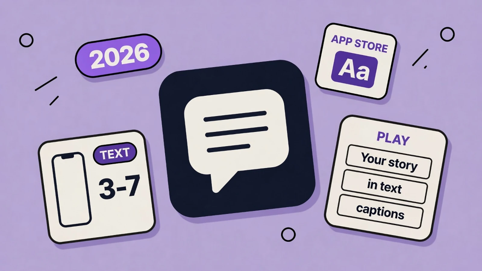
- Use one idea and roughly 3–7 words per frame
- Lead with an outcome, then show the feature that delivers it
- Make the first three captions tell a complete story
- Match the promise in your title and subtitle
- Treat screenshot-text ranking claims as unconfirmed
On this page
App Store screenshot text has one job: make a rushed shopper understand why they should care before they inspect the interface. The app screenshot is proof. The caption is the promise. When the two are aligned, a small thumbnail can answer a very big question: “Is this for me?”
This is a conversion guide first. For the full visual system around those captions, read App Store screenshot best practices. For title, subtitle, and keyword-field limits, use the App Store character-limit reference.
Use a benefit-first caption formula
Start with the person, not the product. A feature label such as “Advanced analytics” asks the viewer to do mental work. “See where your money goes” gives them a reason to install. The feature can still appear in the UI beneath it.
| Feature-led | Benefit-led |
|---|---|
| AI meal planner | Know what to cook tonight |
| Expense analytics | See where your money goes |
| Calendar integration | Your day, in one place |
| Custom workout plans | Train for your next 5K |
| Shared lists | Keep everyone on the same page |
The strongest captions express a concrete result, while the real app interface demonstrates the feature behind it.
Match the searcher’s intent without stuffing keywords
Your app name, subtitle, and keyword field are the durable places to express your ASO strategy. Screenshot captions should echo that promise in normal human language. A person who searched “budget planner” should not land on a first frame that only says “Beautiful charts.” They should quickly see a relevant outcome, such as “Plan every dollar with confidence.”
- Use the category phrase only when it reads naturally: “Build habits that stick,” not “Best habit tracker habit tracker.”
- Keep the title, subtitle, first screenshot, and first caption on the same promise.
- Reserve one idea for each frame instead of repeating every keyword on every frame.
- Never use claims the live app cannot support, such as “#1” or “guaranteed results.”
Keep captions short enough to work as thumbnails
The first few App Store screenshots can be seen at a fraction of their export size. That makes dense copy, thin type, and clever-but-long headlines expensive mistakes. Aim for 3–7 words whenever possible. If the idea needs a second sentence, make the headline do the job and treat the smaller line as optional support.
| Use | Good target | Why it works |
|---|---|---|
| Primary headline | 3–7 words | Fast to scan in search and easy to set large |
| Supporting line | 0–10 words | Adds proof only when the headline needs it |
| One screenshot | One promise | Keeps the UI and message from competing |
| First three frames | A complete story | Explains the product before a shopper swipes away |
Short, high-contrast captions are more likely to be understood before a viewer studies the app UI.
Plan the first three captions as a story
Do not make the opening frames three unrelated feature posters. Give the viewer a simple progression: the desired result, the key mechanism, then the proof or repeatable habit. The exact wording changes by category, but the logic stays stable.
| Frame | Caption | What the UI should show |
|---|---|---|
| 1 | Build habits that stick | A clear daily plan and progress state |
| 2 | Small steps, every day | The simple check-in flow |
| 3 | See your streak grow | A believable progress view or milestone |
The first three frames should move from outcome to product mechanism to proof, rather than listing disconnected features.
Caption patterns you can adapt
- Finance: “Know where every dollar goes”
- Fitness: “Your next workout, ready”
- Photo editing: “Make every shot pop”
- Language learning: “Speak with more confidence”
- Family organizer: “Everyone knows the plan”
- Meditation: “Find a quieter moment”
Write App Store screenshot text in 10 minutes
Use this short workflow before you open a design tool. It prevents a set of polished screens with no coherent message.
Write the searcher’s question
Finish the sentence “I need an app that helps me…” with the core job your product solves.
Draft three outcomes
Write three plain-language results: the core win, the mechanism, and the proof. Ignore visual style for now.
Cut every line to one breath
Keep the headline to roughly 3–7 words. Delete filler like “easily,” “powerful,” and “all-in-one.”
Pair each line with real UI
Choose a screen that visibly supports the promise. Do not put a billing or settings screen under a life-changing headline.
Check at thumbnail size
Zoom out until the whole frame is small. If the caption is not understood almost instantly, enlarge it or shorten it.
Generate and refine the set
Use AppGrowthKit to turn those captions and real app screens into editable, store-ready layouts.
The short version
- Your screenshot caption is the promise; the UI is the proof.
- Write benefits users can feel, not settings-menu labels.
- Keep one short, readable idea per screenshot.
- Align captions to search intent, but do not stuff keywords or overstate unconfirmed OCR effects.
- Use the first three frames to tell a complete product story.
Frequently asked questions
How much text should be on an App Store screenshot?
Use one short headline per screenshot, usually 3–7 words. Add a small supporting line only when it makes the benefit clearer. The caption should be readable at thumbnail size without covering the app UI.
Does Apple index text in screenshots?
Apple does not publicly confirm screenshot text as a direct App Store ranking factor. Some ASO practitioners have observed possible OCR-related effects, but evidence is mixed. Captions should primarily be optimized for clarity, relevance, and conversion.
Should every screenshot use the same keyword?
No. Keep the listing’s overall promise consistent, but give each screenshot one distinct role in the story: outcome, mechanism, proof, or a valuable secondary use case. Repeating a keyword unnaturally makes the set less persuasive.
What is the best first screenshot caption?
The best first caption names the main result your ideal customer wants and pairs it with a real screen that proves the product can deliver it. It should make sense even if the viewer sees only that one frame.
Need store-sized exports? Use the App Store screenshot generator or the Google Play screenshot generator.
Keep reading
App Store Screenshot Best Practices (2026)
How to design App Store and Google Play screenshots that convert - first-three rules, captions, storytelling, localization, and what to avoid in 2026.
App Store & Google Play Character Limits (2026)
Exact character limits for every App Store Connect and Google Play metadata field - name, subtitle, keywords, promo text, descriptions - plus how to use each one.
How to Make App Store Screenshots with AI (2026)
Indie devs on X keep saying the same thing: designing App Store screenshots takes forever. Here’s a practical AI workflow that ships store-ready frames in minutes - without Figma babysitting.
Free tools that help here
ASO Character Counter
Count characters for every App Store and Google Play metadata field against exact store limits. Live counts and over-limit warnings - nothing gets truncated at submission.
Screenshot Beautifier
Add polished backgrounds, padding, shadows, and rounded corners to any screenshot in seconds. Perfect for social posts, docs, and portfolios.
Turn your caption ideas into store-ready screens
AppGrowthKit helps you pair real app screens with clear benefit captions, edit every layer, and export for App Store and Google Play in one workflow.
Try AppGrowthKit