iPad App Store Screenshots, Not Scaled iPhone
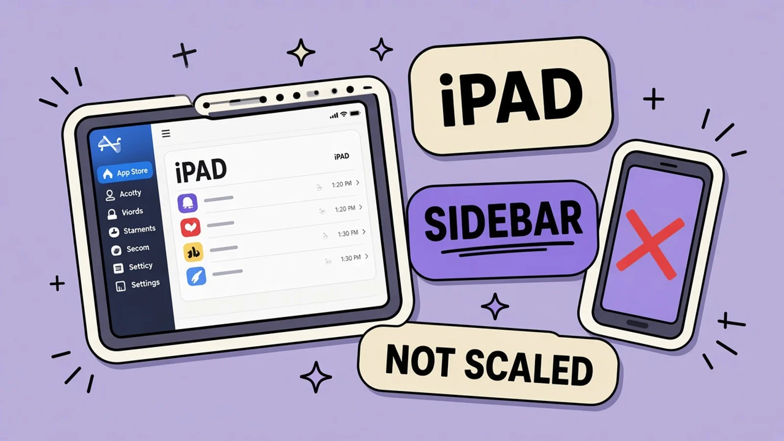
If the binary supports iPad, the 13-inch screenshots are required. They have to show the iPad layout, not a phone image stretched onto a tablet canvas.
Quick answer
How should iPad App Store screenshots be laid out?
If your binary supports iPad, 13-inch screenshots are required. Shoot the iPad layout: sidebar, canvas, split view, the way the app actually runs on a tablet. Do not scale an iPhone screenshot onto that canvas. The phone layout is a single column. The iPad layout is not. Pixel sizes are in the screenshot sizes guide. This page is about the layout those pixels have to contain.
On this page
- Key takeaways
- Support for iPad means the slot is required
- Shoot the layout the tablet actually uses
- Worked example: a drawing app with a sidebar
- Leave the sidebar readable
- Frames and orientation are layout choices
- Same story, different composition
- Make an iPad screenshot from the iPad layout
- Frequently asked questions
iPad App Store screenshots are pictures of the iPad app. If the binary supports iPad, Apple requires the 13-inch set. The usual shortcut, dropping an iPhone screenshot onto a large canvas and scaling it, fails for a layout reason, not only a pixel reason. A phone UI is a column. An iPad UI has room for a sidebar, a canvas, and sometimes a second pane. Stretching the column does not create those.
The pixel table, including 2064×2752 for the 13-inch slot, is in App Store screenshot sizes. This page does not repeat that table. It is about what to put inside the file. Frames, if you use them, still have to leave the UI readable, which device frames covers. Capture steps are in how to make the screenshots.
Support for iPad means the slot is required
If the app runs on iPad, the listing needs iPad screenshots. “It is mostly an iPhone app” is not a waiver. Shoppers on iPad see the iPad gallery. An empty iPad slot, or a phone image pretending to be one, is what they judge. Check the binary’s device support before you decide you can skip the set.
You still get one screenshot set per device size per localization. The iPhone set and the iPad set are different slots. They can tell the same story. They cannot be the same file scaled. Uploading the iPhone PNG into the iPad well either fails the dimension check or, if you padded it, shows a phone floating in a field of background.
Shoot the layout the tablet actually uses
Open the app on an iPad simulator or device at the size you must export. Look at the first screen a new user gets in full-screen. Note where navigation lives. On iPad that is often a sidebar, a top bar with more room, or a split view with a list and a detail. Screenshot that. Do not screenshot the iPhone simulator and hope a background color will hide the difference.
Split view is part of the platform, but the store shot should show the layout you designed for the full window, unless your app’s main case is living beside another app. A screenshot of a squashed split view you did not design looks like a bug. A screenshot of the full iPad window shows the sidebar and the canvas the way you intend people to work.
Worked example: a drawing app with a sidebar
The app is a drawing tool. On iPhone the tools are a bottom shelf and the canvas is the whole screen. On iPad the tools live in a sidebar, the canvas sits in the remaining width, and a layers panel can open on the trailing side. That sidebar is the product difference. If the iPad screenshot is a scaled phone, the sidebar never appears, and the listing sells the phone app to tablet buyers.
Frame one on iPad shows the canvas with the sidebar open and a simple drawing in progress, not a finished poster you pasted in. Frame two shows the brush size where the finger actually changes it, in the sidebar, so the control is visible. Frame three shows layers, because that is why someone wants the bigger screen. The caption stays short. The sidebar has to remain readable when the file is previewed smaller than 2064 pixels wide.
| Element | On iPhone | On iPad |
|---|---|---|
| Tools | Bottom shelf | Sidebar beside the canvas |
| Canvas | Nearly the full width | The width left after the sidebar |
| Layers | A sheet over the drawing | A panel that can sit beside the work |
| Store file | The iPhone slot | 13-inch slot, not a scaled phone PNG |
The iPad screenshot has to show the sidebar and canvas together. Scaling the iPhone shelf-and-canvas layout does not produce that screen.
Leave the sidebar readable
iPad files are large, and people still meet them in a smaller preview. A sidebar full of 12 tiny tool icons becomes mush. For the store, open the sidebar in a state with fewer, larger tools, or a state where the active tool is obvious. You are not documenting every brush. You are showing that the iPad app has a real tool column.
Captions should sit in a band that does not cover the sidebar or the drawing hand. Screenshot best practices apply here: one idea, type that survives a shrink. A caption stretched across a tablet in a thin weight will fail even when the layout is correct.
Frames and orientation are layout choices
If you add a device outline, use an iPad outline around an iPad capture, inside the required pixel size. An iPhone bezel centered on the 13-inch canvas is the scaled-phone mistake with extra steps. Many drawing apps are more honest in a wide layout because the sidebar and canvas sit side by side. Export the orientation the slot allows and the app actually uses. Do not rotate a portrait phone shot and call it a tablet.
Right-to-left languages move the sidebar to the other side. If you localize into Arabic or Hebrew, mirror the iPad UI. Do not keep a left sidebar from the English capture and only translate the caption. That is the same class of error as scaling, just in the other direction.
Same story, different composition
The iPhone set and the iPad set can share a promise: draw, change the brush, use layers. The composition should not be shared. On the phone, the brush tool is a sheet. On the tablet, it is the sidebar. Write captions that fit each composition. “Tools beside the canvas” is an iPad line. It is a lie on the phone set.
AppGrowthKit matters when you are producing both sets from real captures and need the iPad file at 2064×2752 without someone resizing the phone export at the last minute. Keep the phone project and the tablet project separate so a one-click scale cannot sneak back in.
Make an iPad screenshot from the iPad layout
Do this only if the binary supports iPad. If it does not, do not fake the slot.
Confirm the binary supports iPad
Check the target devices on the version you are submitting. If iPad is supported, plan on the 13-inch screenshots. If you removed iPad support, do not upload leftover tablet images that show a layout the binary no longer has. The listing and the binary have to describe the same app.
Run the iPad layout full screen
Launch on an iPad simulator or device and use the full window. Open the sidebar if that is the normal drawing setup. Put a simple mark on the canvas so the screen is in use, which is what guideline 2.3.3 asks screenshots to show. Do not shoot an empty splash.
Capture sidebar, canvas, and one depth screen
Take the working canvas, the brush control inside the sidebar, and the layers panel. Skip a scaled copy of the iPhone bottom shelf. If a panel covers the drawing completely, choose a state where both the tool and the canvas are visible. The point of the tablet is that they fit together.
Export the 13-inch file without scaling a phone
Export at the size in the screenshot sizes guide, 2064×2752 for the 13-inch slot. Check the pixel dimensions on the file. If the width and height match only because you stretched an iPhone PNG, throw it out and export from the iPad capture instead.
Read it beside the iPhone set
Put the two sets next to each other. The promise can match. The layout must not. You should see a sidebar on the tablet and a column on the phone. Then shrink the iPad image and confirm the active tool is still identifiable. Upload that set to the iPad slot for the localization.
Key takeaways
- iPad support on the binary makes 13-inch screenshots required.
- Show the iPad layout: sidebar, canvas, panels. Do not scale an iPhone screenshot.
- Pixel sizes stay in the sizes guide. 2064×2752 is the 13-inch file, with iPad content inside it.
- Keep the sidebar readable at preview size. A row of tiny icons is not a layout.
- Arabic and Hebrew need the sidebar mirrored, not just a translated caption.
Frequently asked questions
Can I upload one screenshot set for both iPhone and iPad?
No. They are different device slots with different pixel sizes and different layouts. The iPhone set does not satisfy the iPad requirement. If the app supports iPad, supply the 13-inch screenshots from the iPad UI. Reusing a phone file, even letterboxed, shows the wrong product.
What if my iPad app is just a scaled iPhone app?
Then the screenshot will look like a scaled iPhone app, because that is what you shipped. If you can, design the sidebar or split view before you market the tablet. If the binary truly only stretches the phone UI, do not add a fake sidebar in the screenshot that the app does not have. Honesty beats a pretend layout.
Do I screenshot Split View or full screen?
Screenshot the full-window layout you want people to understand, unless the product’s main use is side by side with another app. Split View changes widths and can hide the sidebar. A store image of an accidental narrow window looks broken. Show the composed iPad screen, then make sure the app survives Split View in the build.
Where are the exact pixel dimensions?
In the App Store screenshot sizes guide. The 13-inch iPad slot is 2064×2752 when you need that set. This article does not replace that table. Use it for every size you upload, and use this page to decide what the iPad composition should contain before you export.
Should the iPad captions match the iPhone captions word for word?
Match the promise, not the line breaks. A caption that refers to a bottom shelf is wrong next to a sidebar. Rewrite the iPad lines so they describe the tablet screen. Keep them short enough to read in a preview. The localization, if you add one, needs its own iPad set with the layout mirrored when the language is right to left.
Need store-sized exports? Use the App Store screenshot generator or the Google Play screenshot generator.
Keep reading
App Store & Google Play Screenshot Sizes (2026)
Every required and optional screenshot dimension for iPhone, iPad, Mac, Watch, Apple TV, Vision Pro, and Google Play - straight from Apple and Google's current specs.
Device Frames on App Store Screenshots
A device frame is allowed on an App Store screenshot when the file is still the exact required size and the app UI stays legible.
App Store Screenshot Best Practices (2026)
How to design App Store and Google Play screenshots that convert - first-three rules, captions, storytelling, localization, and what to avoid in 2026.
How to Make App Store Screenshots (2026)
A start-to-finish workflow: capture real UI, write captions, frame at exact sizes, export without alpha, and upload in App Store Connect.
Right-to-Left App Store Screenshots
Arabic and Hebrew read right to left. The screenshot has to mirror the interface, not only translate the caption.
Free tools that help here
Top App Store Apps
Track Apple App Store top charts across 30 countries. View top free and paid rankings for ASO research - updated from Apple's public RSS feed.
Screenshot Beautifier
Add polished backgrounds, padding, shadows, and rounded corners to any screenshot in seconds. Perfect for social posts, docs, and portfolios.
Shoot the sidebar, not a stretched phone
Capture the iPad drawing layout at the required size so the canvas, tools, and caption all belong on a tablet.
Try AppGrowthKit for Free